Financial advisor websites typically look like crap and it’s because of all the BS and nonsense. Read this blog to learn how to avoid the mistakes.
But first…
For those of you who are new to my blog, my name is Sara. I am a CFA® charterholder and financial advisor marketing consultant. I have a newsletter in which I send you one actionable, practical marketing tip a day. Please sign up here!

#1 Unremarkable home page
Let me ask you a question.
If you were going to sell your house, you wouldn’t have the front door have rusted hinges, cracked paint, and be painted a dull brown color, would you?
Then why on earth, when the home page is the most important page on a financial advisor’s website, would you make it so boring and generic that it’s impossible to tell one advisor’s website from the next?
The home page of your website is prime real estate, financial advisors!
- The header image should show high human expression. This engages the reader and evokes feeling. Inanimate objects are hard for humans to connect with visually.
- No long, clunky blocks of text. Use pithy, bolded phrases.
- Make a call to action right away (download this retirement toolkit or whatever) with an easy button.
- The menu bar should not be overwhelming; no more than five tabs.
- Make sure the text is big enough to read. You shouldn’t have to squint.
#2 Wording that suffocates the reader
I feel like I am suffocating to death every time I visit a financial advisor’s website. Curtail the use of adjectives and adverbs as much as possible in your writing.
They clutter your sentences – and financial copy is already dry and boring enough to begin with!
The fewest words possible, the better.
Example:
When you fail to take an RMD, there are serious, negative consequences.
Instead:
When you fail to take an RMD, there are consequences.
Example:
Is it totally necessary to withdraw the funds today?
Instead:
Is it necessary to withdraw the funds today?
In both cases you are saying the same thing with fewer words. It may seem like a small thing but it’s not.
Reducing words your writing clear and easy to understand. It also reduces the energy required on your part to do the writing. A website should be no more than 2,000 words. The majority of text should be on the Home, About, and Fees pages.
For most of you, there is no differentiation. What you have to say is no different from the next advisor.
Don’t believe me?
Go to Google and enter, “financial advisor near me” and then compare the first three websites with yours.
See what I mean?
So, your best bet is to say as little as possible. Write just enough to trigger the search engines.
And that is it. Marketers make alot of money off you financial advisors by selling you on the “bells and whistles.” The reality is that it’s wrong for most of you.
#3 Not installing Google tools (or looking at them)
Look, I get it – you financial advisors don’t have time to obsess over your websites because you are busy saving the world from retirement nightmares.
But that doesn’t mean you can’t find 20 minutes a month to look at your Google Analytics and Google Search Console.
Check out this blog on Google tips for financial advisors and let me know if you have any questions.
#4 The fakely declarative “Why we’re different page”
FINANCIAL ADVISOR: Our approach is “unique.”
FIN ADVISOR ALSO: Because we focus on financial planning and wealth management strategies so you can achieve your life goals and retire with peace of mind.
Okay first of all, nobody says anything other than “we’re fiduciaries with 20 years of experience who love our clients and will put your needs first.”
Second of all, having to point blank say why you are different is a little bit contrived. Don’t you think people should know by now? If you really were different, they’d already get it from everything else you said on the website!
I’d work on pointing out the key differences in the part of the website where you talk about those aspects of your practice: service page, fees page, team page, etc. That way it reads more naturally than some grandiose, grandstanding declaration.
Example: (the teams page)
Every week, our team of advisors meets and we each share a challenging case. We then discuss the best approach, based on our experiences. Sometimes we invite our CPA or estate attorney colleagues to participate, and share their most challenging cases as well. This is how we ensure that we are staying on top of the best approach to solving problems and learning from our industry partners.
That says way more than some fake-sounding declaration, “We’re different because we’re team players and we think outside the box to solve problems.”
#5 Awful block text
It’s hard for me to believe when you say “we simplify things” when the home page of most financial advisors’ websites look like an appellate legal briefing. Long words, long sentences, long paragraphs. Keep the paragraphs to two (maybe three) sentences at maximum, especially on the home page. It should be pithy copywriting.
Use semicolons to chop up your sentences and give the reader a chance to breathe.
Wrong:
A lot of people want to pay down their mortgage as a lump sum but what many of them fail to consider is that you might be getting a mortgage interest tax deduction that reduces the amount of federal income tax you would pay in that calendar year.
(Argh!!!! Pulling my hair out reading this!!!!)
Right:
It may sound appealing to pay off your mortgage in one lump sum; don’t overlook the tax deduction!
Ah, much better.
(sigh of relief)
Chop up your sentences into smaller, simpler nuggets and you’ll see higher engagement from readers.
You financial advisors drive me nutso with the teeenny tiny font on your website!!!
- I shouldn’t have to squint or enlarge the screen to read anything on your home page.
- Ask somebody with bad vision if they can read your website easily. If not, increase the font size.
- If you can’t enlarge the text and still fit all the words on the page, cut the copy down.
- And by the way, make sure it’s dark enough. Faint words drive me nuts, too.
Look, do me a favor and just take 5 minutes today and increase the font size on your website, anyways. It’ll look better.
#5 Tacky phrases
“Comprehensive financial planning”
You know, I didn’t think financial planning was, by its own definition, comprehensive. I thought that you were going to pick random milestones like buying a house or electing to take social security.
#6 Nonsense lists and awards that you most likely paid for
I would literally rather hear about your college job as an EMT rather than how you got onto the top producer list or some crap financial advisor list like Investopedia top advisor.
#7 Uninspiring lead magnets
I am sooooo tired of you financial advisors and your boring lead magnets. If you are asking someone to give you their email in exchange for a pdf, at least make it NEW and EXCITING instead of the same tired old “retirement readiness kit.”
Here are some ideas:
#1 Traps to avoid when dealing with the Social Security Administration
#2 Script for what to say in your first meeting with a financial advisor (estate attorney, CPA, etc.)
#3 Guide to Understanding your risk tolerance (for reeeeeal)
Check out this blog on financial advisor lead magnets for more ideas.
#8 Rambling and generic bios
Financial advisor bios are notorious for being dry, boring, and saying the same thing. Why not liven it up by presenting your bio in bullet points rather than prose?
Consider the difference between these two bios.
(boring)
I started loving the stock market when I was in third grade. I continued to study it and even went to college and earned a financial planning degree. My first job after graduating college was helping a CPA in Detroit with tax returns and I worked there for 15 years. I started my own firm after that and we help individuals, families, and business owners to sleep better at night and achieve their goals.
vs.
(slightly more exciting)
- Detroit native and lifelong Red Wings fan
- Bought my first share of stock in third grade (General Motors)
- Bachelor degree in financial planning
- 15 years of tax planning experience
- Launched firm in 2021
You see the difference, right?
What would your bio look like in bullets? Write it out today and send me the two for comparison!
#9 FAQ pages stink
If you have an FAQs page, get it off your website.
Here are three reasons why FAQs pages are useless on a financial advisor’s website:
- If the question was of high importance, you should have addressed it front and center on the home page.
- If it’s of minor importance, you can discuss it when you meet. The objective of a website isn’t to provide every single detail. Nobody will remember anyways.
- The focus of your website should never be about you and your firm (after providing the necessary details with total transparency). It should always be about the client, how you meet their needs, and what their expe
The pages on your website that people are going to look at the most are: home, team, and fees. Check your Google Analytics and you’ll see.
I’d rather see you invest time improving those pages, instead of distracting the reader by ushering them off to an FAQ page with minutiae that they’ll find out later anyways.
#10 Hidden contact info
Phone and email should be both in the header and footer of your website. After you have done the hard work of getting someone’s attention to the point they want to talk to you, don’t mess it up by making it hard to reach you.
Moreover, I am not very impressed by these “Contact Us” pages.
- Some websites don’t offer an email anymore, but simply present a scheduler or Calendly link. I find it cold, impersonal and overly “salesy” when a financial advisor lacks the patience to answer a simple question before I recommend them to someone who trusts me.
- Moreover, I find that when I do reach out and ask a question through the “ask me a question” form, I rarely get a response. Ice, ice, baby.
- Website forms often ask for too much information. I might give you my email, but don’t ask me for my cell phone number.
- When a contact email is offered, it’s usually an “info@” email address. Using your personal email is very inviting but may cause you to get a ton of spam. I’d recommend “hello@(your domain).”
#11 Uninspiring quotes
A powerful quote can elevate the impact of your writing; but people mess it up.
Punctuate it correctly. The period goes inside the quote mark, not outside.
Right:
“Call me later.”
Wrong:
“Call me later”.
Pick a short, punchy quote because long quotes bore people. Remember you are using somebody else’s words. Give proper credit where it is due. Include enough information so that the reader would be able to access the same source. Read this blog about how to do a proper citation.
The whole point of using a quote is to break up the monotony of your writing. Picking a quote that has boring words or that everyone has heard before is pointless. Take the time to find a striking one and it will make your writing more memorable and powerful.
#12 Lastluster “what we do” pages
You financial advisors are killing me with these awful “what we do” or “our services” pages on your websites.
Most “what we do” pages are an after thought and a data dump.
They don’t go far into depth at all. This makes it hard to articulate the value of your services and why they are superior to what the next advisor is offering.
Make it a powerful statement about your value to the client instead!
- For SEO purposes, restate who the clientele are that you serve, “We are financial advisors for teachers in Burlington County, New Jersey.”
- Don’t just list out each service (fin planning, estate planning, wealth management) with some cookie cutter definition that sounds like you cut-and-pasted from Investopedia, and some generic icons like a bullseye, a notepad with a pen next to it, etc.
- Include an example of each type of work product next to the service. For example, when you talk about financial planning, actually link to a sample financial plan. Or, even better, make a video that goes through what a typical plan entails.
- List the fee clearly next to each service or, if you are bundling, next to each bundle of services. Make it clear exactly what you are doing, and what the price is.
- Indicate the frequency and duration of the provision of these services. If you provide a risk assessment once a year and the process takes 1-2 months, for example, indicate that when you discuss the services. If you provide financial planning on an “ongoing” basis, what exactly is the deliverable? A meeting to discuss the financial plan once a month? Once a quarter?
You’ll have an advantage versus the competition when you can clearly articulate what you do and what it costs in a way that makes it real to the client. That is what the “services” page on a financial advisor’s website should do.
Dust off the laptop and give the “services” page a rewrite!
#12 Not knowing your website traffic
Open Google Analytics and go to Reports Snapshot/Acquisition/Overview.
Look at the number of views and the time period over which these views occurred.
Deeper question:
The reeeeeaal question is, “How many views should I be getting if I want to get leads each month?“
Ah ha!
Let’s do the math.
Let’s say you get 3,000 views on your site a month. Assume the bounce rate is 50% (half the people stay for a few seconds and then leave). That means you’ve gotten 1,500 meaningful views.
Let’s say that 3% of those meaningful views are people who are qualified to hire you and who would be interested in doing so at some point. That’s 45 people.
Sound fair?
Now…
Let’s say 95 to 97% of those 45 people are not going to play ball right now. They will not reach out to you on their own. They are not ready to meet you.
So 43 of those people won’t be leads.
It’s likely that 3-5% of those 45 people ask you for a meeting (that’s about 2 leads a month).
What it means for you:
- You need to get 2-3k views on your website a month before you start to see real lead flow (2 leads, in the example above).
- Most of the qualified people are going to walk away if you don’t do something to stay in touch with them. That is why it is critical to offer them a lead magnet, an event (e.g., webinar), newsletter, or get them to follow you on social media.
Just some hypothetical numbers – not a guarantee but it’s typically how I’ve seen it go.
Ah the agony!
Yah, digital marketing is no joke. It’s hard work to get leads from your website if you are a financial advisor. You have to know how much website traffic you are getting if you want to know if you need to get more traffic in order to increase lead flow.
#13 Not making it easy to navigate
Use radio buttons to help people navigate your website more easily.
Check out this page from MYRA Wealth.
See the radio button there?
The user can elect which category applies to them.
I can slide it to my status – whether I’m a household or an individual – and it allows me to see only the options available to me and what they cost.
The radio button makes the irrelevant stuff go away.
(breath of fresh air)
Clarity is sooooooo relieving, do it this way financial advisors! Ask your website person to make it happen.
#14 Ignoring bad website traffic
Question from a subscriber: “What is the best way to get more website traffic? Or should I even care about that?”
Yes, you should care about your website traffic. Otherwise what’s the point?
If you don’t care, take down the website and save yourself the $30 a month on hosting (+tax?).
(Real talk. I live in NYC, okay?)
Now, let’s say you decide to keep it.
Here are three quick ideas.
- Including a few basic Search Engine Keywords (SEO) to trigger Google to send people your way based on geography. It drives me nuts when I have to use a treasure map to find out where you are located. On the home page, for example, “I am a financial advisor in Boise, Idaho.” The keyword that is triggered is “Boise, Idaho.” See here for more Google tips.
- Include your website on your social media account profiles. Take a minute and pull up your LinkedIn, for example. Is the website listed in the Contact Info field? Is there a website link on your Twitter page?
- Get listed on as many industry directories as possible. NAPFA, CFP Board, and Fee-Only Network all have advisor search apps. If you are already on there, revise it every 6 months.
#15 Using “we” as a solopreneur
I’ve seen solo financial advisors do all sorts of ridiculous things to make themselves look bigger, from creating “advisory boards” just to have someone else on their About page, to hiring a virtual assistant to answer the phone.
Referring to yourself as “we” instead of “I” on purpose is nonsensical. Eventually they will find out it’s just you.
If you are self-conscious about being a solo advisor, here are some things you can do:
- Use technology to improve response times and give you an operational edge.
- Have a succession plan or at least someone who you have a formal arrangement with who could step in if you were to become incapacitated, and make it known on your website.
- Apply 3x the effort to delivering value. Deliver to the level that people think you are on crack.
- Have a value proposition that would choke a horse (see above). Most advisors have nothing compelling to say when asked why you should hire them.
#16 Trying too hard to look big
Should I use ‘we’ instead of “I” on my website to make myself look bigger?”
Question from a subscriber: “I’m a one person shop. Should I use ‘we’ instead of “I” on my website to make myself look bigger?”
Nooooooo way.
Get outta here with that.
I’ve seen solo financial advisors do all sorts of ridiculous antics to make themselves look bigger, from creating “advisory boards” just to have someone else on their About page, to hiring a virtual assistant to answer the phone.
Look, it is what it is.
If you are self-conscious about being a solo advisor, here are some things you can do:
- Use technology to improve response times and give you an operational edge.
- Have a succession plan or at least someone who you have a formal arrangement with who could step in if you were to become incapacitated, and make it known on your website.
- Apply 3x the effort to delivering value. Deliver to the level that people think you are on crack.
- Have a value proposition that would choke a horse (see above). Most advisors have nothing compelling to say when asked why you should hire them.
At the end of the day, it comes down to value – not semantics on the website. Why is what you do valuable, why is it more valuable than the next advisor, and why is that value multiples higher than the price it costs?
BOOM – and there’s today’s marketing tip for ‘ya!
-Sara G
P.S. Here are some blogs that can help.
Financial advisor value proposition
Put DIY prospects in their place
#17 No more sloppy fee pages!
Today’s Daily tip: Your website’s Fees page shouldn’t look like a cluttered mish mosh.
No need to putter around about how you are a fiduciary, you treat each client like your mom, etc. This is not the place for “feel good” stuff.
You want absolute directness and clarity here.
Take this action TODAY:
Delete everything on your Fees page, except the compliance disclosures at the bottom.
Then, in the blank space, write something like this:
Here are my fees:
Assets under management Annual fee (as % of your portfolio)
0-$500k 1.0%
$500k to $1MM 0.75%
$1 to $2.5MM 0.65%
$2.5+ 0.60%
The fee is automatically debited out of your account at Charles Schwab on the last day of the quarter.
For more information, please see our ADV Part 2 (insert hyperlink over those words).
Or this:
The cost of a one-time financial plan is $5,000, payable via check or Venmo. Payment is due in advance of service.
For more information, please see our ADV Part 2 (insert hyperlink over those words).
Or this:
My hourly rate is $350/hour, payable via check or Venmo. Payment is due in advance of service.
For more information, please see our ADV Part 2 (insert hyperlink over those words).
Sara’s upshot
A few tips for the Fees page.
- Tell them how the payment gets paid.
- Tell them when payment is due.
- Make sure you include a “0” to the left of the decimal if you are quoting AUM fees <1%. It makes it clear that it’s 0.50% vs. 50% or 5%
- It would be best to show the client what the AUM fee amounts to in real dollars, but make sure you ask compliance how to do that first.
- Put the dollar amount or % in bold.
- Make sure the columns are justified correctly. It looks weird when the numbers don’t line up vertically.
Don’t be cutesy wootsie on the Fees page. The focus should be on clarity, not entertainment.
#18 Cluttered Menu
Does your website main menu look like this?
Home, Services, Process, About Us, Tools, Resources, Blogs, Video Tutorials, Getting Started, Client Portal, Contact Us
Does it stretch across the entire length of the screen with very little space in between each tab?
Now just imagine the last time you were presented with a list with too many options, and all of them sounded the same/vague. How did you feel? Overwhelmed and probably hesitant to take any action.
- The tabs on the main menu of your website are like drawers in a file cabinet. You are inviting a prospect to open the file cabinet. Present them with no more than 5 drawers to open.
- Condense all your resources into one tab. Don’t have a tab for “Guides”, and then one for “Knowledge Library”, one for “Blog”, and one for “Video Tutorials.” Lump all of these together and call it the “Learning” tab.
- The tabs on the menu should be short words. Instead of “About Us”, say “Us.” Instead of “Client Profile”, say “You.” Instead of “How we are different” say “Difference.”
- The menu tabs should give off an action feeling. Think about the contrast between “Process and Strategy” and “Working Together.” Or, the contrast between “Our Services” and “Building.” Instead of “Resources”, call it “Learning.”
Were my financial advisor website tips helpful?
Alright that’s all for now.
Did you sign up for my daily newsletter?
Or if you want me to help you revamp your website, send me a message.
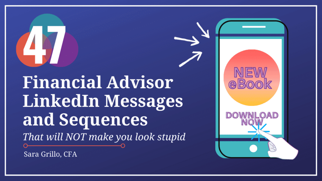
If you’re into LinkedIn…
Learn what to say to prospects on social media messenger apps without sounding like a washing machine salesperson. This e-book contains 47 financial advisor LinkedIn messages, sequences, and scripts, and they are all two sentences or less.
You could also consider this LinkedIn training program which teaches financial advisors how to get new clients and leads from LinkedIn.
Thanks for reading. See you in the next one!
-Sara G
Disclosures
Grillo Investment Management, LLC does not guarantee any specific level of performance, the success of any strategy that Grillo Investment Management, LLC may use, or the success of any program. Nothing in these materials may be construed as an investment, insurance, or financial recommendation. For such a recommendation, consult with a financial advisor.
Grillo Investment Management, LLC will strive to maintain current information however it may become out of date. Grillo Investment Management, LLC is under no obligation to advise users of subsequent changes to statements or information contained herein. This information is general in nature; for specific advice applicable to your current situation please contact a consultant or advisor. Opinions stated by third parties may not be correct and do not reflect the views of Grillo Investment Management, LLC. Grillo Investment Management, LLC may not be held accountable for any statements made by third parties.